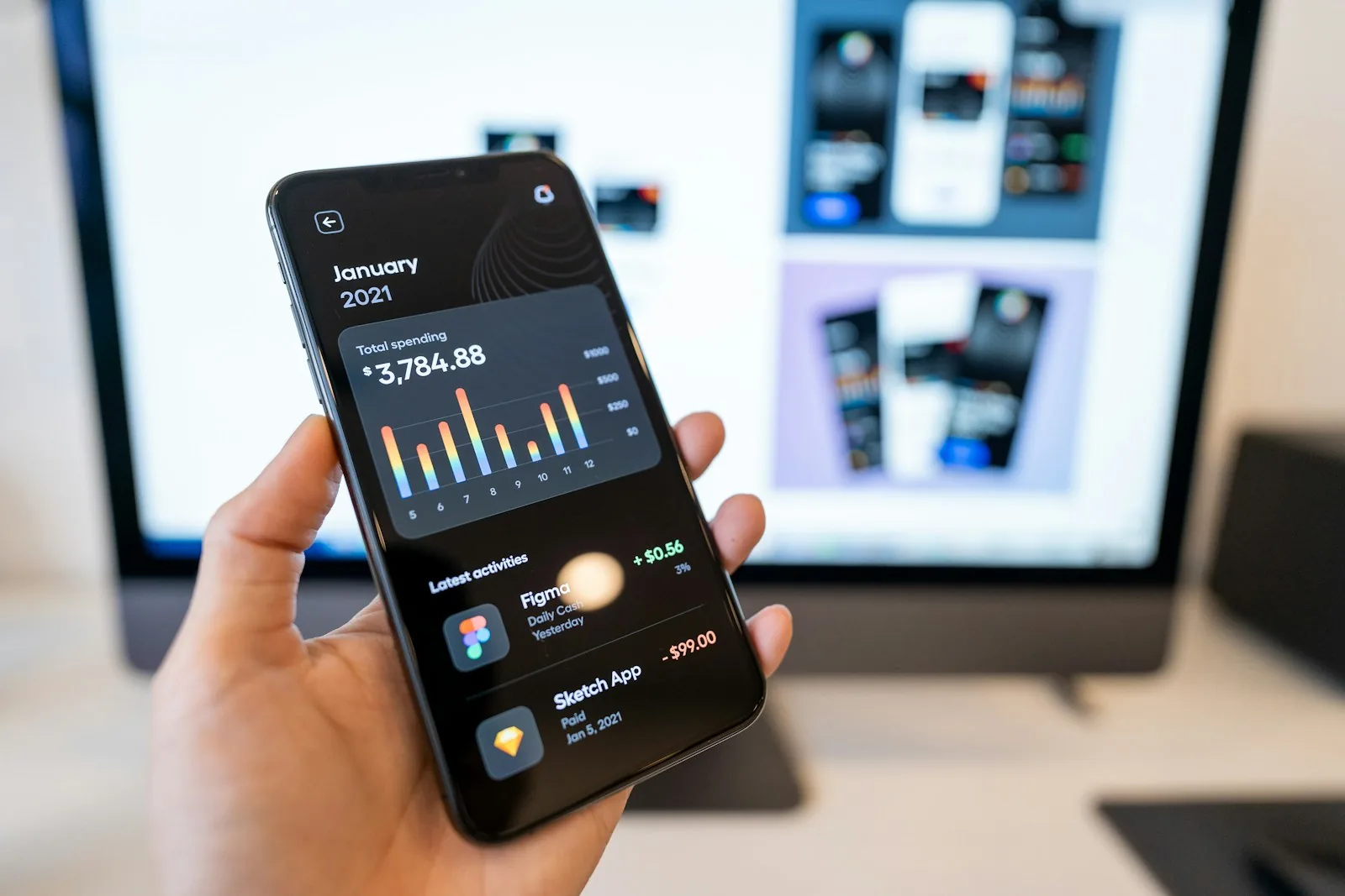

In a money app, the assistant can explain and prepare. Moving money stays with the user, on a screen they understand.
Fintech UX design in North Africa: what AI changes for startups
Fintech UX design in North Africa used to be a question of clean screens, fast onboarding and a payment flow that does not fail on a slow connection. Now almost every founder pitching a wallet, a lending app or a business banking product in Casablanca, Tunis or Cairo also wants an AI assistant inside it. That raises a harder design question: how do you put a model that sometimes gets things wrong inside a product where every mistake touches someone's money?
The short answer: design AI in a fintech product as a careful assistant, not an autonomous banker. Let it explain, summarise, categorise and prepare actions, and keep every movement of money behind a clear human confirmation. For North African users, that assistant also has to work across Arabic, French, English and often Darija, on mid-range phones and patchy networks. Startups that get those basics right earn trust. Startups that ship a chatbot first and fix trust later usually do not get a second try.
Why fintech is the hardest place to add AI
Most products can survive an AI feature that is occasionally wrong. A bad playlist suggestion costs nothing. A wrong balance explanation, a mislabeled transfer or a confident answer about fees that turns out to be false costs the user money and costs the startup its reputation.
Fintech also carries regulation. Rules on consumer protection, data handling and disclosures differ by country, and the regulator in each market decides what an app may say and do. A design team cannot treat those rules as legal fine print added at the end. They shape which actions the assistant is allowed to take, what it must disclose, and where a human or a hard rule has to sit instead of a model.
The pattern work behind this is covered in AI product design patterns for models that get things wrong. Fintech is where those patterns stop being good practice and become the product.
The hype, the reality and the fear
The hype: an AI money assistant that understands everything, answers every question in any language and moves money on a voice command. Plenty of pitch decks promise this.
The reality: language models are good at explaining, summarising and drafting. They are unreliable at exact arithmetic on their own, they can state wrong things fluently, and they do not know your fee schedule unless you give it to them and check the answer. The parts that hold up today are narrow and useful: plain-language explanations of a statement, spending categorisation the user can correct, help-center answers grounded in your own documentation, and drafting a transfer or bill payment that the user reviews before confirming.
The fear: founders fear falling behind competitors who already advertise AI. Designers in the region fear that AI tools will make their work interchangeable, or replace it. Both fears have the same honest answer. In fintech, the hard and valuable part is designing trust, consent and recovery, and no model does that for you. The designers who learn to specify how an assistant behaves when it is unsure, and how a user undoes a mistake, become more valuable, not less.
The Explain, Prepare, Confirm model
A practical way to scope AI in a fintech product is to sort every AI feature into one of three levels. Call it the Explain, Prepare, Confirm model.
Explain covers features where the AI only reads and describes. Why did my balance drop this week? What is this fee? What does this loan term mean? Mistakes here are recoverable, so these features are the right place to start. Ground every answer in the user's real data and your own documentation, show where the answer came from, and give an easy route to a human agent.
Prepare covers features where the AI drafts an action but does not execute it. It fills in a transfer, suggests a savings rule, or pre-fills a loan application from documents the user uploaded. The design job is to make the draft fully visible and fully editable, with every number, recipient and date shown in plain sight before anything happens.
Confirm is the line no model crosses on its own. Moving money, changing a beneficiary, accepting a credit offer or sharing data with a third party always ends with an explicit confirmation step that the user understands. The more serious the action, the more friction is appropriate. Speed is not the goal at this step. Clarity is.
Startups that keep their first release inside Explain and Prepare can ship AI features early without betting the company on a model's judgment. Agentic features that act on the user's behalf are coming to finance too, and the supervision and approval patterns for them are covered in agentic UX for products that act for the user.
Traditional fintech UX vs AI-assisted fintech UX
Design decision | Traditional fintech app | AI-assisted fintech app (done well) | AI-first chatbot app |
|---|---|---|---|
Main way users act | Forms and menus | Forms and menus, plus an assistant that explains and drafts | Chat for almost everything |
How money moves | Explicit user steps | Assistant prepares, user confirms on a clear review screen | Often a single chat confirmation |
Handling uncertainty | Not needed, rules are fixed | Shows sources, admits when unsure, hands off to a human | Frequently answers confidently anyway |
Languages | Usually one or two, fixed per screen | Arabic, French and English, with tolerance for mixed input | Depends entirely on the model |
Low bandwidth and older phones | Designed for it | Core flows work offline or degraded, AI is an extra | Breaks when the model is slow |
Error recovery | Support tickets | Undo, edit before confirm, visible history | Hard to see what happened |
Best for | Simple payments and transfers | Most North African fintech products in the next two years | Demos and narrow support use cases |
For most startups in the region, the middle column is the sensible default. The chatbot-first column demos well and tends to struggle with real money and real users.
What to design differently for North African users
Three things matter more in this region than in many generic fintech design guides.
Language is mixed, not chosen. Users often switch between Arabic, French and English in the same session, and many type Darija in Latin characters. An assistant that only understands one formal register will feel foreign. Design the input to tolerate mixed language, let users pick the language of answers, and test right-to-left layouts with real content, including numbers, dates and currency symbols inside Arabic text.
The network is not guaranteed. The core flows (check balance, send money, pay a bill) should never depend on an AI response arriving. Treat the assistant as an extra layer on top of a product that already works. Where on-device models fit, they can help keep simple features responsive, a trade-off explored in on-device AI in mobile apps.
Trust is earned slowly. Many first-time users of a digital financial product are cautious for good reasons. Show fees before the user commits, explain every status in plain words, make the support route obvious, and never let the assistant sound more certain than it is. Clear copy does more for trust in a money app than any visual flourish.
Where fintech UX design in North Africa is heading
Over the next one to three years, expect assistants in finance apps to move from answering questions to preparing more of the routine work: reconciling business expenses, drafting invoices, flagging unusual activity and explaining it. Expect regulators to pay closer attention to how automated advice and decisions are disclosed. And expect the design work to shift from drawing screens toward specifying behavior: what the assistant may do, what it must ask, how it explains itself and how a user reverses a mistake.
That shift favors product teams who can write those rules as clearly as they design interfaces. For startups, it means the design partner you choose should be able to talk about consent, failure states and supervision, not only about visual style.
Where Digcy fits
Digcy is a product design and development studio serving Casablanca, Morocco and Africa remotely and working with clients globally. It is a Dribbble Selected Agency with 50+ projects delivered, and its work includes ZeroDrift, an AI compliance platform that raised $2M from a16z, a regulated, trust-heavy product of the kind this article describes.
Fintech teams can start with the fintech product design page or the mobile app design services page. If you want to meet a team close to the market, see the UI/UX agency in Casablanca. For products with AI at the core, the AI product development service covers models, evals and the interface around them, and founders comparing partners across the continent can read about the product design agency for Africa.
FAQ
What is the most important part of fintech UX design in North Africa?
Trust. Users need to understand fees, statuses and what happens to their money at every step, in a language they are comfortable with, on the phone and network they actually have. AI features should strengthen that trust by explaining things clearly, never weaken it by acting without a clear confirmation.
Should a fintech startup in Morocco add an AI assistant to its app?
Yes, if it starts with features that explain and prepare rather than features that move money on their own. Plain-language statement explanations, spending categories the user can correct and grounded help answers are good first steps. Keep every money movement behind an explicit review and confirmation screen.
Will AI replace UI/UX designers working on fintech products?
No. AI tools speed up drafting screens and copy, but the core of fintech design is deciding how the product behaves when something is uncertain or goes wrong, and how users consent and recover. That work needs people who understand users, regulation and risk. Designers who learn to specify assistant behavior and failure states will be in more demand.
How do you design a fintech app for Arabic, French and Darija speakers?
Let users choose their language and accept mixed-language input, especially Darija written in Latin characters. Test right-to-left layouts with real data, including numbers, dates and currency inside Arabic text. Keep terminology consistent across languages and avoid assistant answers that switch register unexpectedly.
Is AI in banking apps overhyped?
Partly. AI that explains, summarises and drafts is useful today. AI that independently makes financial decisions for users is not ready for most products and raises regulatory questions. The useful middle ground is an assistant that does the reading and drafting while the user stays in control of every decision.

Let’s keep in touch.
Discover more about high-performance web design. Follow us on Twitter and Instagram.